A Curvy Corner statement

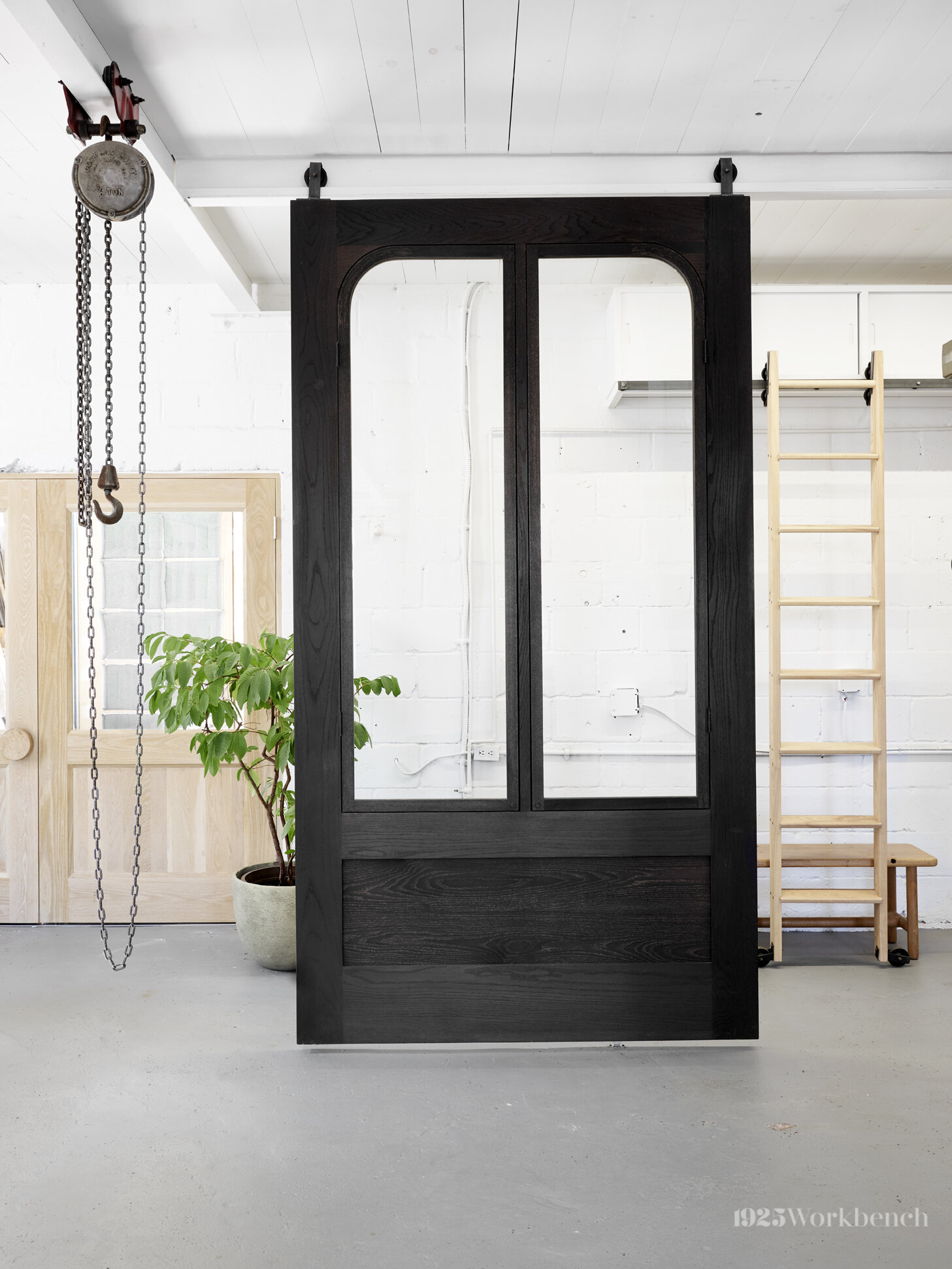
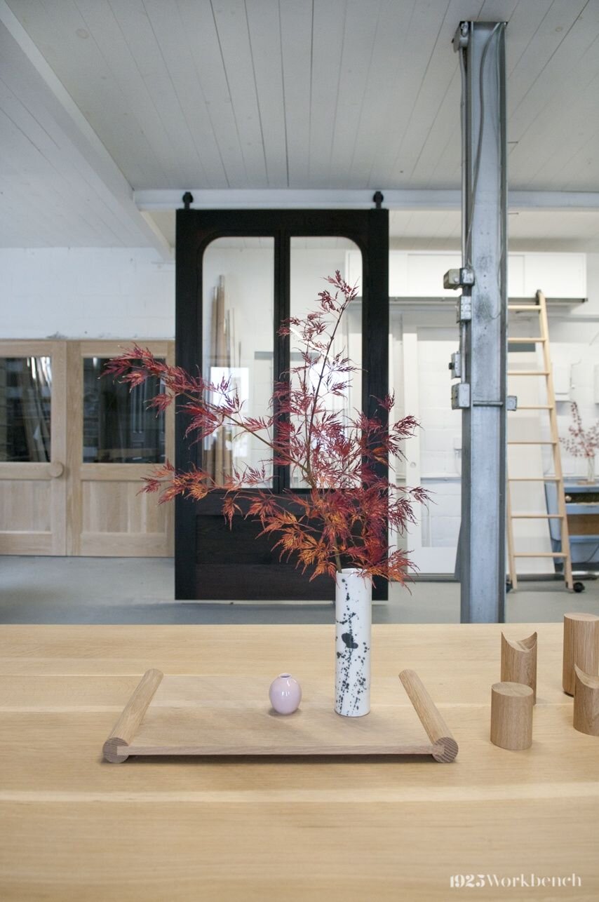
Its ability to be the focal point in a space makes our Curvy Corner door as commanding as it is practical.

Imagine this: You are in an old home in Vietnam. You open the window shutters into a courtyard onlooking a banana tree and breathe in the summer air. These are the childhood memories that inspired the Curvy Corner door.

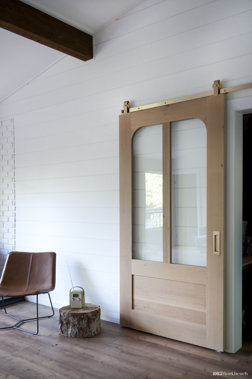
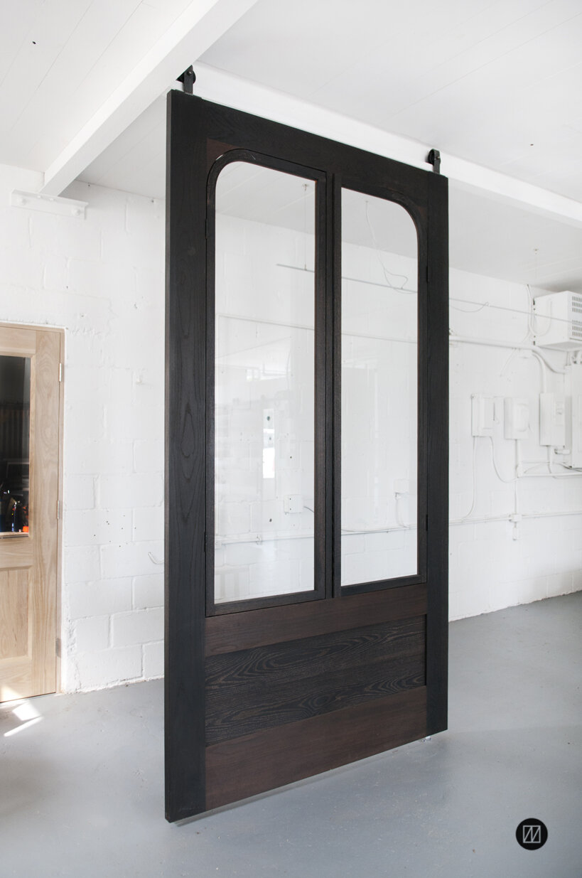
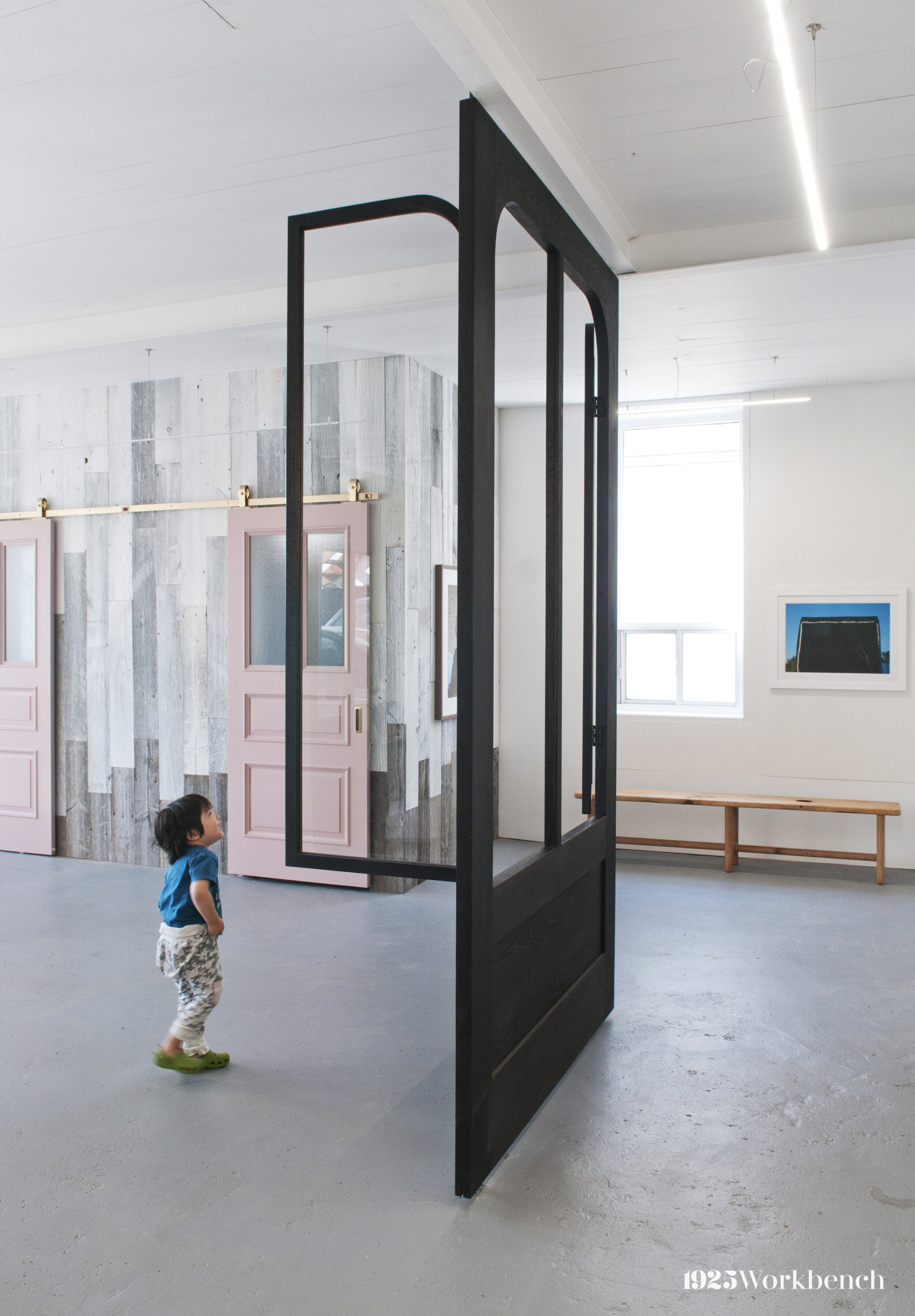
outward-opening windows are inspired by childhood memories of vietnam. door and window frames are in blackened oak. watch them open here.

outward-opening windows are inspired by childhood memories of vietnam. door and window frames are in blackened oak. watch them open here.

Memories from home

We reference Vietnam a lot in our work. It’s one of the ways we put heart into what we do.

We came up with the design in 2017 with the intention of making a bold piece for our studio. The windows, which open outward, are reminiscent of glassless windows in old Vietnamese homes. When our client Vicky (@vickymakesthings) asked us to make it as an entry door, we were excited to bring this inspired piece into a Canadian one.

Little did we know, it would become a client favourite.

The Curvy Corner shape

The door’s solid black colour and curved corners make a statement and leave an impression.

Wanting to emphasize form, My Le thought round upper corners would create interest against the large black door. This effect is achieved using a wood bending technique. My Le chose simple bottom shakers and solid dark colour to further accentuate the shape.

While this door can be made in any wood, the first one was made with blackened oak and remains the popular choice.
One design, more possibilities

See how the Curvy Corner design has been customized for different needs.
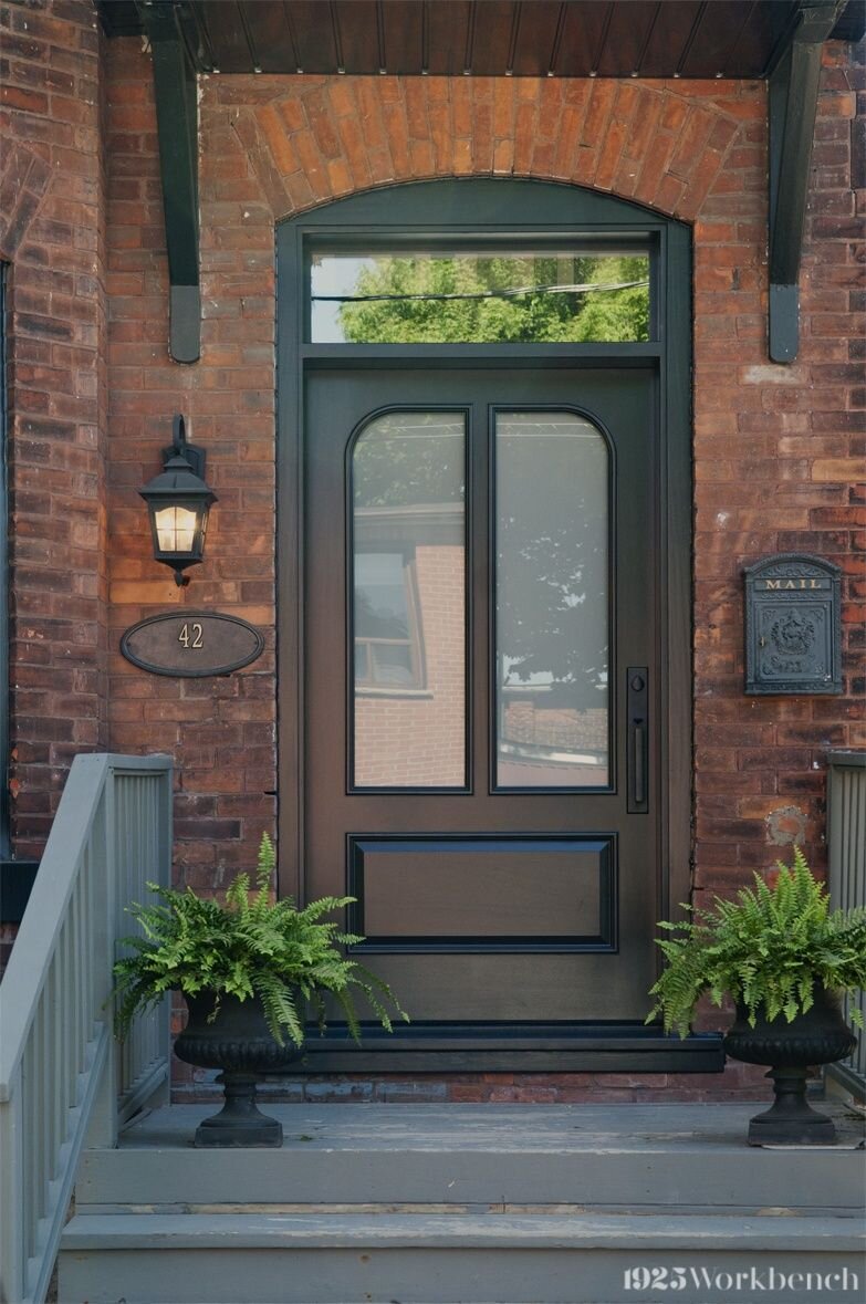
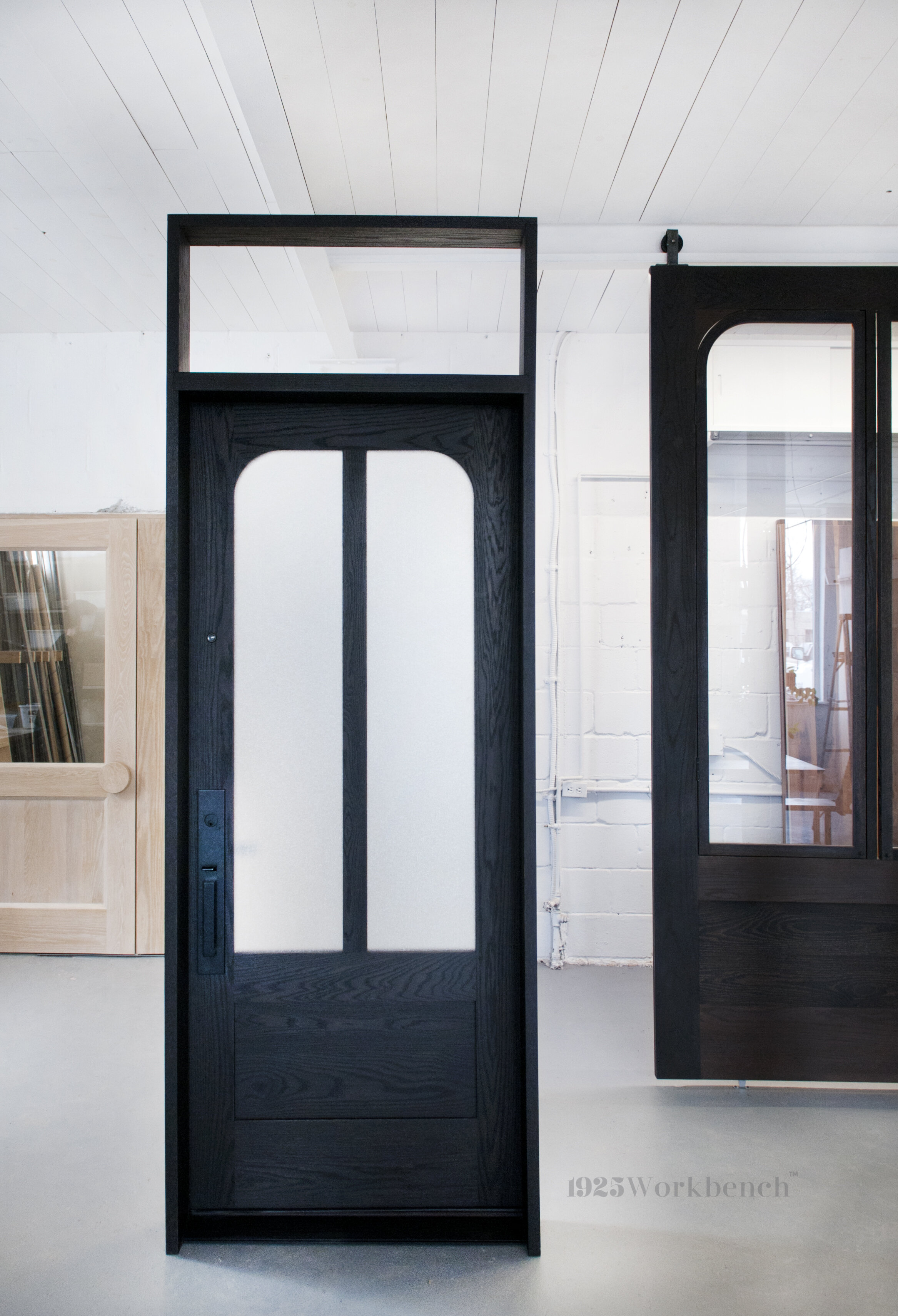
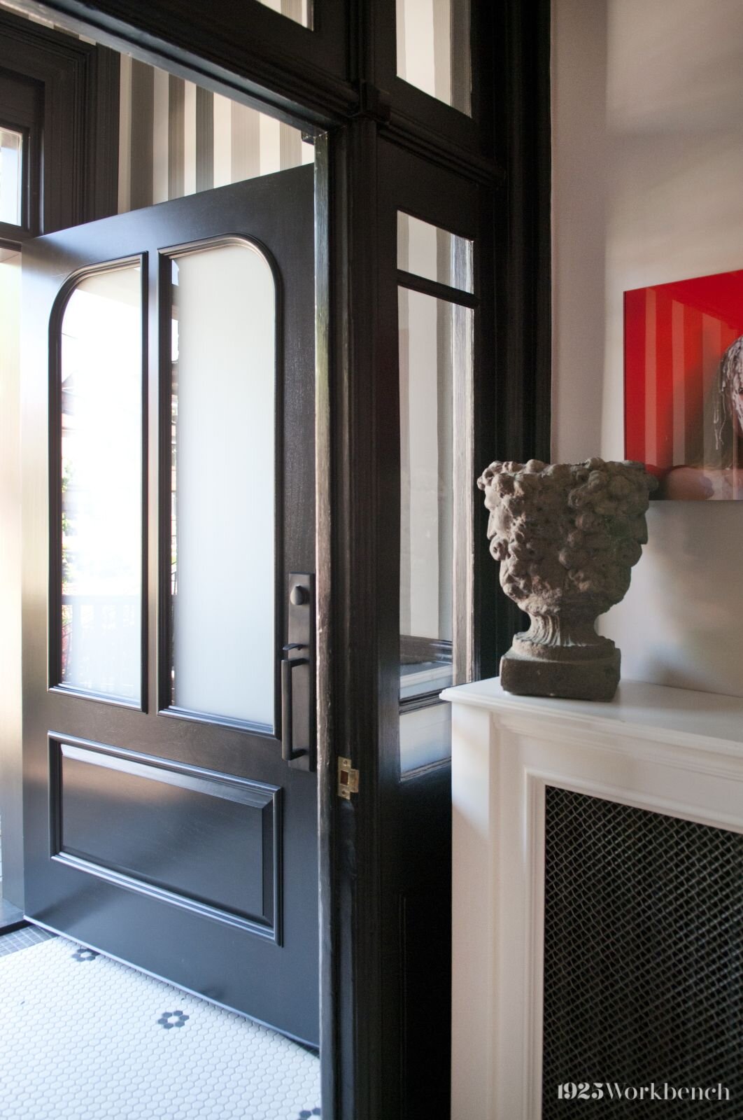
We love this handsome variation of the Curvy Corner door made for Andrea (@gelinasdentalstudio). Crafted in solid mahogany and painted black, the dark colour contrasts nicely against the burnt orange brickwork.

Raised paneling at the bottom and detailed trim give it a stately appearance. Matte black hardware matches the door as to not disrupt the form. It’s finished with a transom and large frosted glass panels for an elegant look.

Interior Design Show 2018.

Interior Design Show 2018.

Our past experience continues to influence what we create. And since inspired design is the best kind, we will keep on doing it.

Note: We are still open for business during this time, although email response times may be longer than usual. If you would like us to make something for you, please email us at info@1925workbench.com with pictures of your space and dimensions.

Catch us on Instagram: @1925workbench

Make it pink

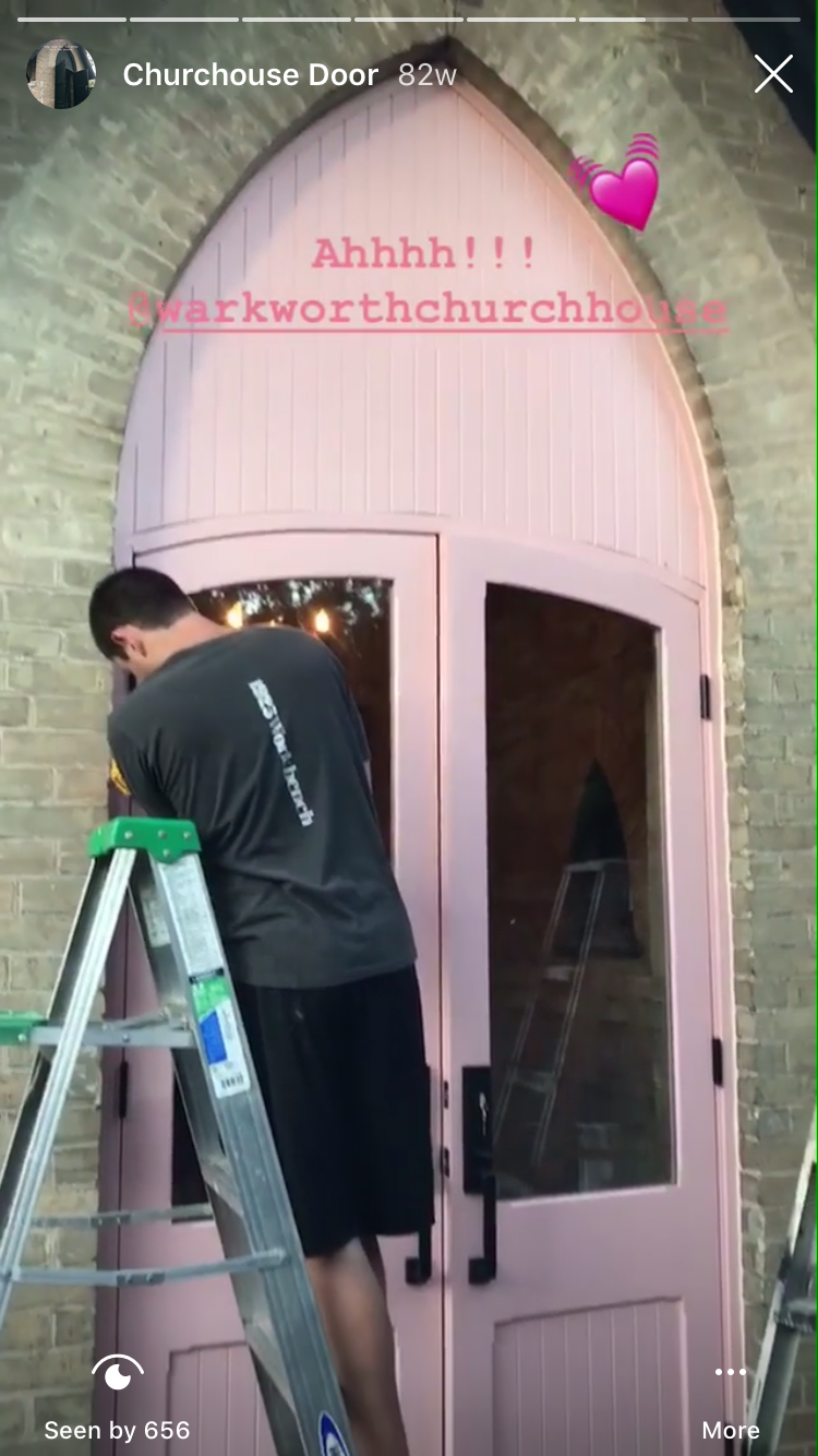
Spring has sprung! Made for a church-turned-residence, these vibrant pink entry doors have since become a signature part of the building.

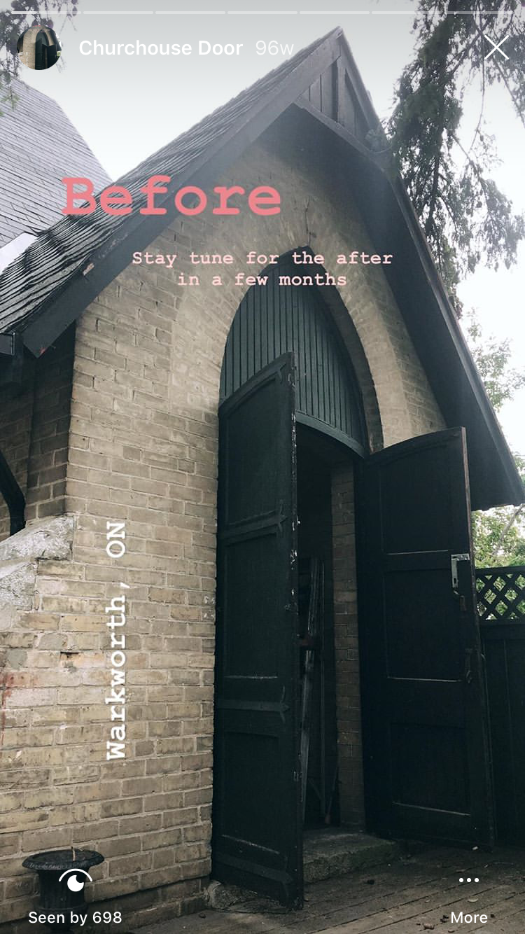
This 19th Century church closed its doors in the 1950s before gaining a new life as a private residence. When Matt and Colin purchased the building in 2018, the entry doors were the first thing they changed. This time in pink.

Our pink entry doors, as featured in the april 2020 issue of Style at home. Photography by Robin Stubbert, styling by Susan Burns.

Our pink entry doors, as featured in the april 2020 issue of Style at home. Photography by Robin Stubbert, styling by Susan Burns.

Before and after

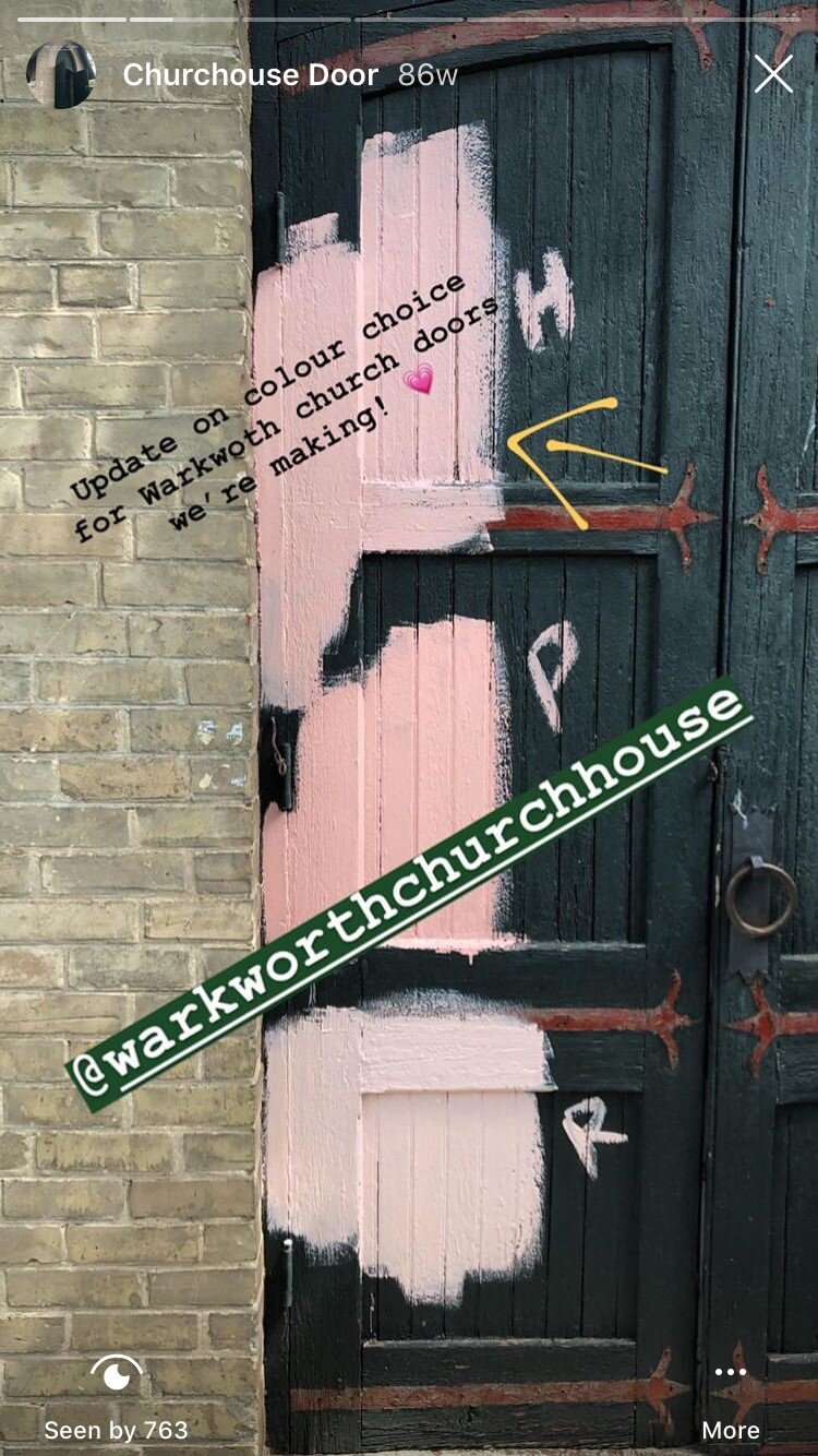
Wanting to replicate the design of the previous doors (as seen below, in black), Colin and Matt incorporated large windows and a pop of colour. To signal the building’s new life, Colin was determined to use pink. But a lot of work went into these doors before installation. Click here for our Instagram highlights documenting the process.

About the doors

Large clear glass windows allow sunlight to bring the space to life from the outside in. There were parts in the original doors that we had fun replicating, such as a little detail in each corner of the panels. Black handles contrast against the paint colour while coordinating with the porch and roof. These door are made in mahogany and painted in a Benjamin Moore colour.

Colour

Finishing the doors in pink was a bold choice that paid off. The brightly coloured doors can be seen from a mile away as they greet visitors and onlookers with open arms.

Pop of pink: Pink Hibiscus (2172-60) by Benjamin Moore.

The entry unit took up our entire studio!

The entry unit took up our entire studio!

churchdoors_sep2018_01_small.jpg

Second life

Gothic Revival style architecture and modern updates lend the home a unique charm that blends the new with the old. Our pieces are often used to update a space or convert one into something new, and this project is no different. We loved making a door that brings a breath of fresh air to a historically rich building.

To learn more about their home, Design*Sponge has an article about Matt and Colin’s story: read it here.

Note: We are still open for business during this time, although email response times may be longer than usual. If you would like us to make something for you, please email us at info@1925workbench.com with pictures of your space and dimensions.

Find us on Instagram: @1925workbench.

Breezeway largely made of Douglas Fir

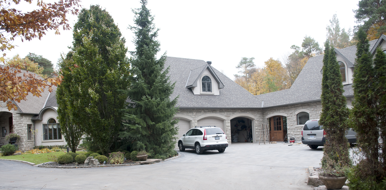
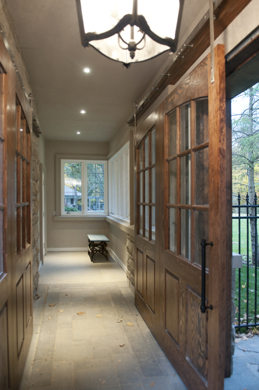
When our client wanted to build another house beside their house for their son's family, they wanted a breezeway that would connect the two houses. But they didn't want to cover up the view or access to the backyard. So the solution is to put two large barndoors across the openings. You can walk right through to the backyard in the summer when these doors will be kept mostly open.

Yes, the house is too big for my camera. If I stood back any further, I would have fallen into bushes.


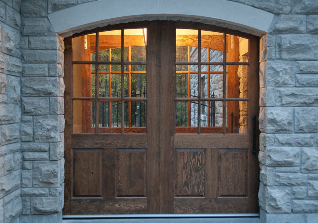
We also made the entry door to the new house out of Douglas Fir.

From the backyard looking into the front.


Closer look at entry door.

Details. This is the connecting line where two doors were made into one large one.

Late in the day. This is from the stand point where family from the new house would begin to walk to the old house.

That white door at the end is where you would enter the old house.


Closed off for the night.