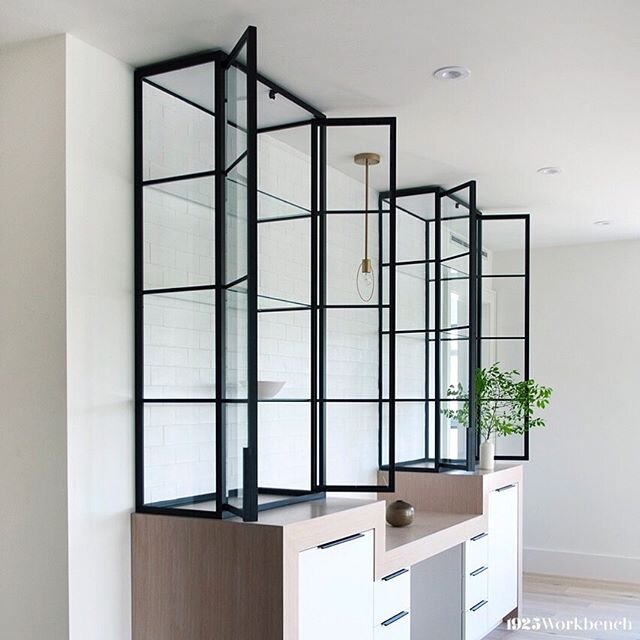
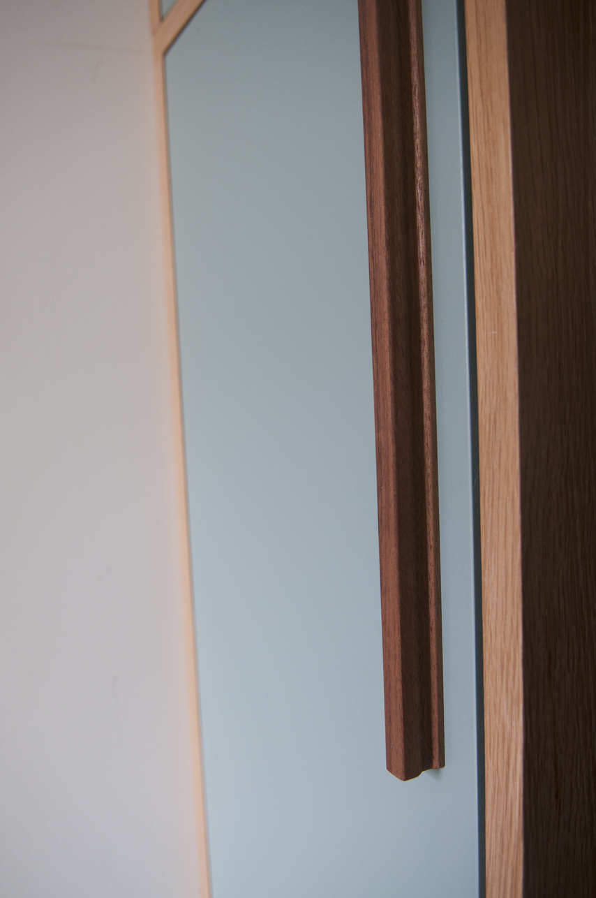
A treasure island in your kitchen

Our love of making things goes beyond doors and into the kitchen with our custom islands. The islands we create are completely different from the cabinetry of the kitchen and therefore stand as a piece of furniture on their own.

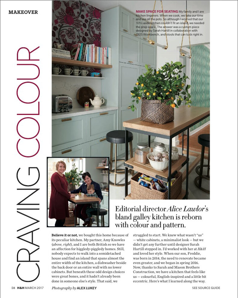
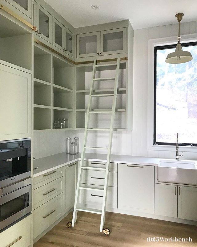
We naturally progressed into making islands as we branched from doors into other furniture. Clients would ask us if we can make a unique island while we were making their door, and we continued from there. A good example of a unique island is one we made for Sarah Hartill from House & Home magazine. It was a really fun project, as the island needed to be very small and functional… but beautiful. We used white oak and metal to make this and it contrasts wonderfully against the green mist cabinetry Sarah chose.

Our custom work allows us to fit in as many built-in features as possible to maximize space. Functionality is important and that’s why these pieces require a lot of consideration to design.

Making space in small ones

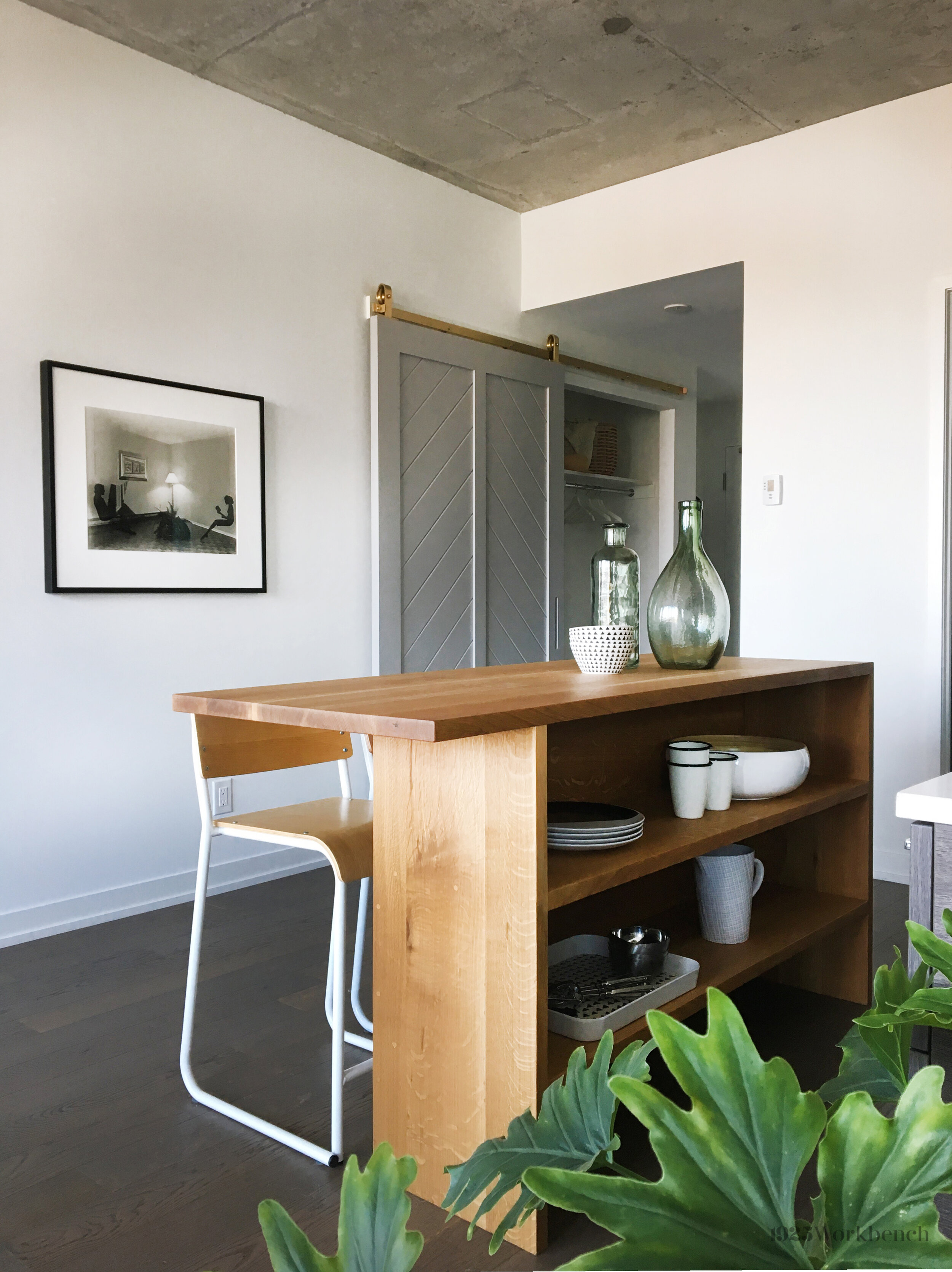
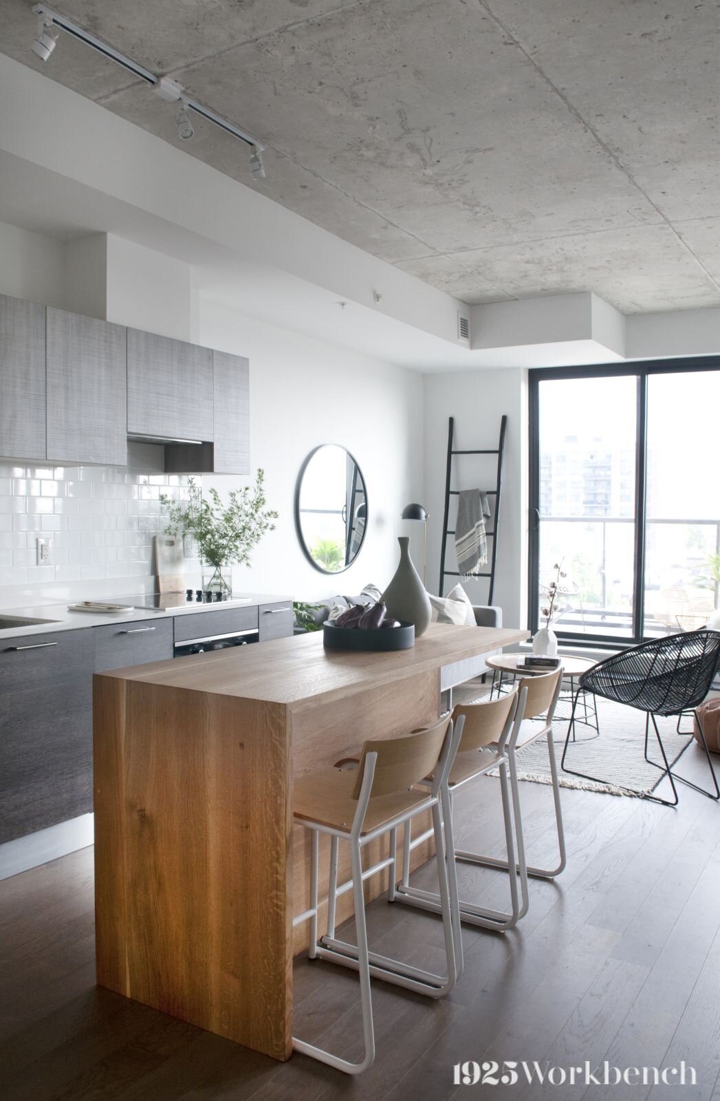
Practicality is important to everything we make: our kitchen islands are carefully designed to meet client’s needs and conserve space. With electrical elements, lifestyle and aesthetics in mind, we craft a space-efficient unit that does more than just look good. Since an island is a great opportunity to create more storage space, we prioritize this in our designs. Anyone with a small kitchen will agree!
Built-in features

Given the custom nature of our work, we have the ability to create pieces that fulfill all of our clients’ needs.

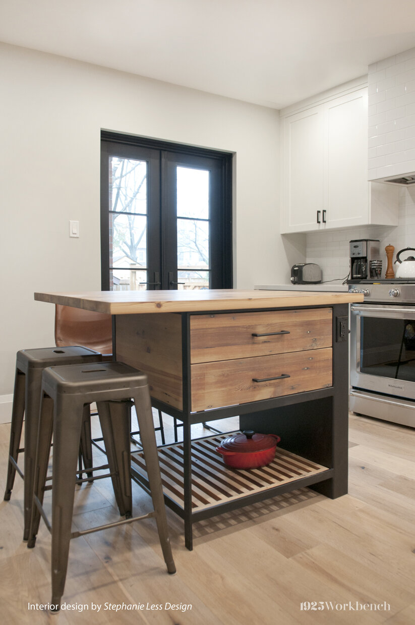
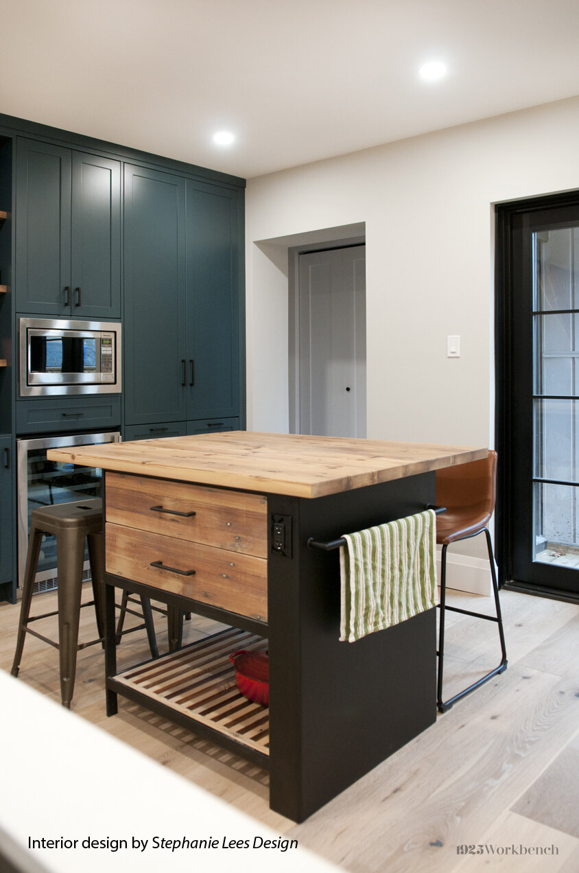
We worked with interior designer Stephanie Lees to create an island with the electrical outlet built into one side of the unit. Stephanie wanted to incorporate the electrical need into the design, which resulted in a beautiful asymmetrical island base.  Made of reclaimed wood and metal, the island now resides in the home it was made for. (which was featured in several media outlets, including Home in Canada magazine).

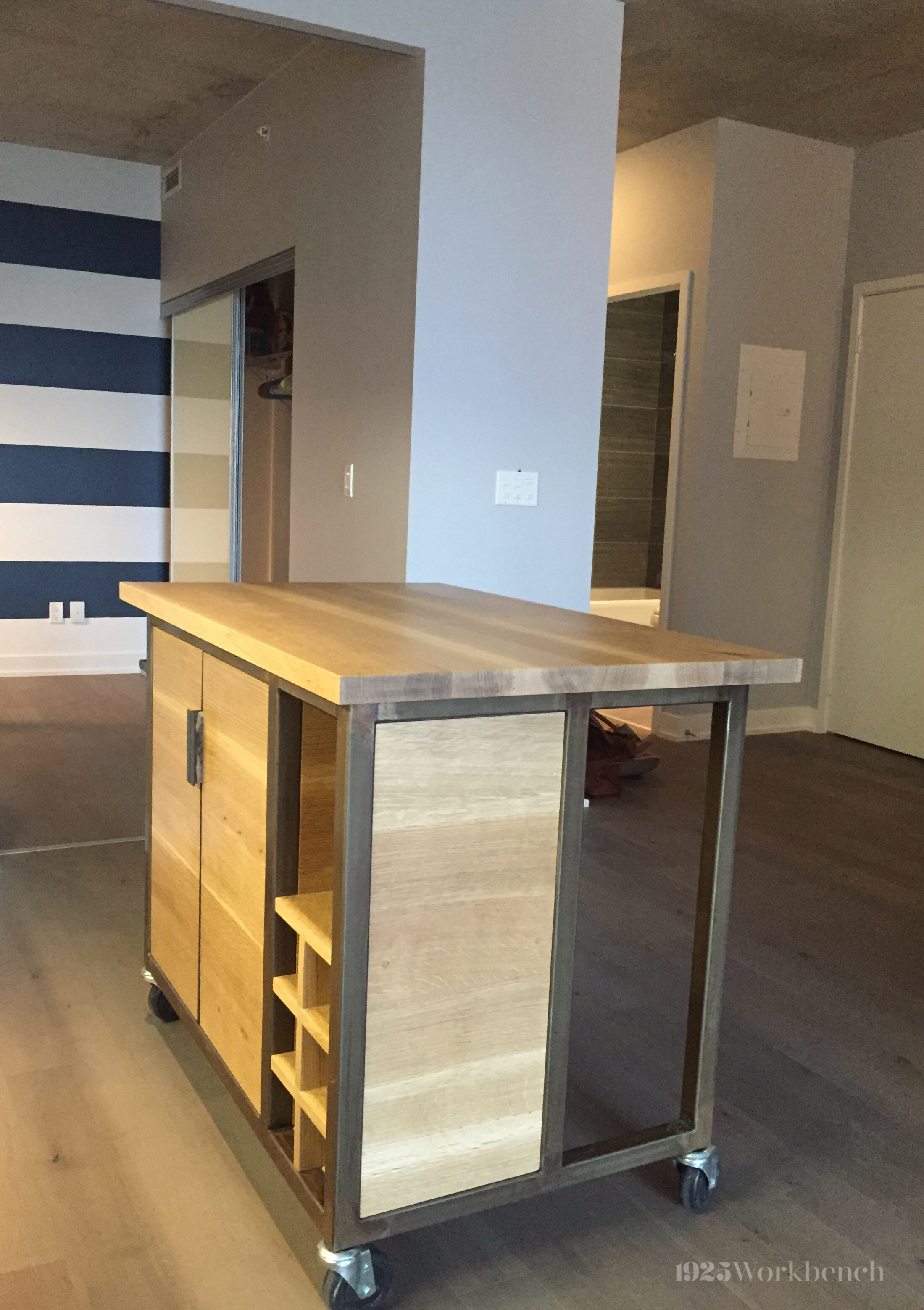
See left, third image in slideshow: This island for our clients’ small condo kitchen has a wine rack, shelving units and space for chairs to fit underneath. The client requested wheels to allow easy transport, which means it can used as a mobile bar (and that’s an idea we can all appreciate!)

If you would like us to make something for you, please email us at info@1925workbench.com with pictures of your space and dimensions.

Naked Truth Skincare

The Naked Truth attitude

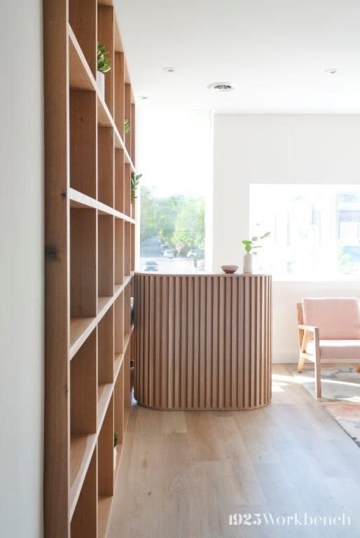
Naked Truth Radiant Skincare values holistic treatments and ethically made products. Owner Kylie McIntee wanted these principles to reflect in the space.

Working with Batay-Csorba Architects, Naked Truth Radiant Skincare now has a beautiful studio showcasing natural materials.

All pieces are made of solid white oak.

Like a cloud

Pastel colours and soft accents create a calming atmosphere that strives for simplicity (a lot like us!). The furnishings allow the natural wood and brass accents to shine.

Our “floating” white oak slats showcase the original brick wall, making use of a unique feature of the space.

Artwork by Natalie Schiabel.
Natural materials are emphasized: White oak compliments the pastel colour scheme and brass hardware finishes.

Natural materials are emphasized: White oak compliments the pastel colour scheme and brass hardware finishes.

Shelving and reception

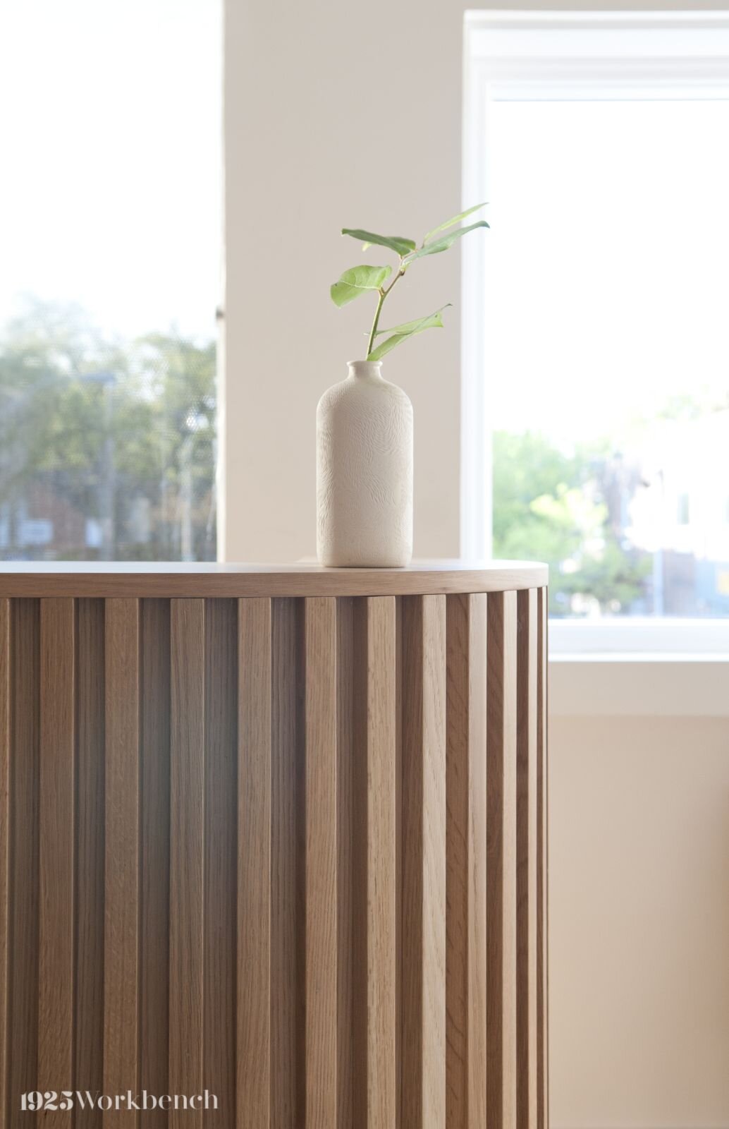
As if floating, vertical white oak slats appear light and airy. These long, thin pieces are labour intensive but we love their effect. Used also for the reception desk (see below right), slats allow the table to be curved to create continuity with the other pieces.

Designed by Batay-Csorba Architects, this reception desk is special because of its sculptural nature and was challenging to make. It’s also the perfect way to be welcomed into a skincare boutique as beautiful as this one.

eZy_watermark_09-01-2020_01-06-20.jpg

If you would like us to make something for you, email us a picture of your space with dimensions to info@1925workbench.com.

Find us on Instagram: @1925workbench.

Our handcrafted tables

Since handcrafting a table for our home back in 2011, custom tables have become a big part of what we do. Combining craftsmanship with our love of woodworking, we have made tables of varying sizes and designs. We wanted to share some of our favourites.

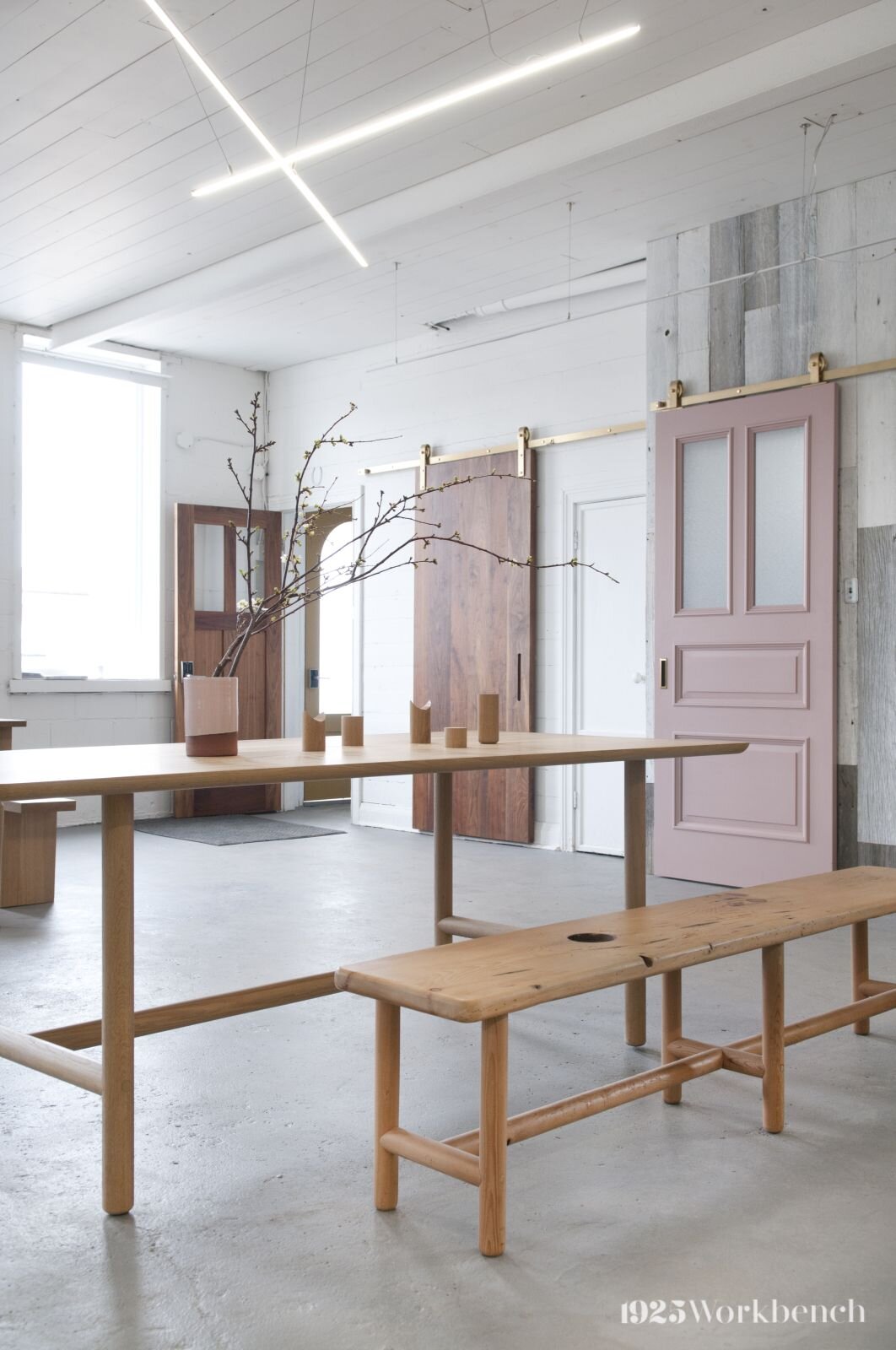
Our nun table in solid white oak. Can you spot our signature pink doors ?

Our nun table in solid white oak. Can you spot our signature pink doors ?

The nun table

By using white oak, a modern wood choice, to make the nun table, which is traditional in design, we’ve changed feel of the table. From vintagy to an updated fresh take on a favourite table form. Its long length is characteristic of this design while drawers on both sides serve as a functional and aesthetic feature.

This table was debuted at the 2016 Interior Design Show (IDS) alongside our pink doors, and Alanna Canvanagh’s art. It was an exciting year at IDS as we felt our work was well received.

Piping table

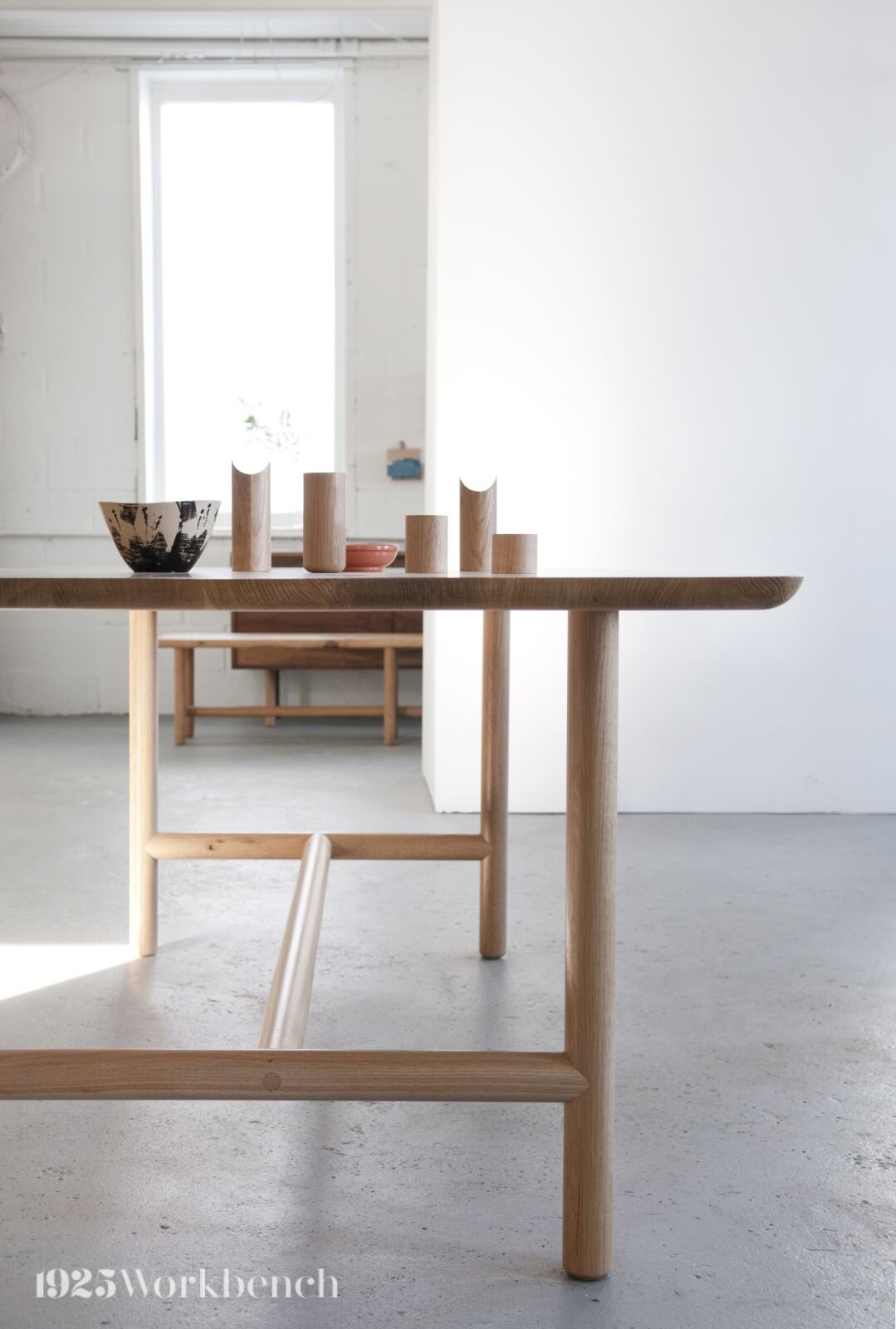
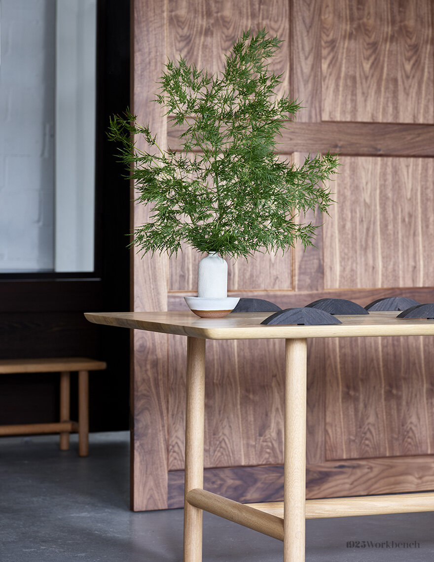
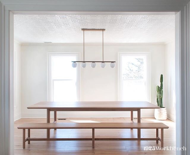
When Make Good Design liked a bench we made inspired by Vietnamese bamboo daybeds, we translated the bench’s design into a table for the space they were designing. Legs and stretchers are all the same size, and seamlessly jointed for a clean look. Made in solid white oak. In these pictures of the table, you can see the bench we started with.

We showcased the Piping table at IDS2018 with our curvy black door and newly patented single track bypass hardware.

eZy_watermark_02-01-2020_02-59-41.jpg

Custom work creates opportunities for new and exciting designs, like our race track table.


Race track table

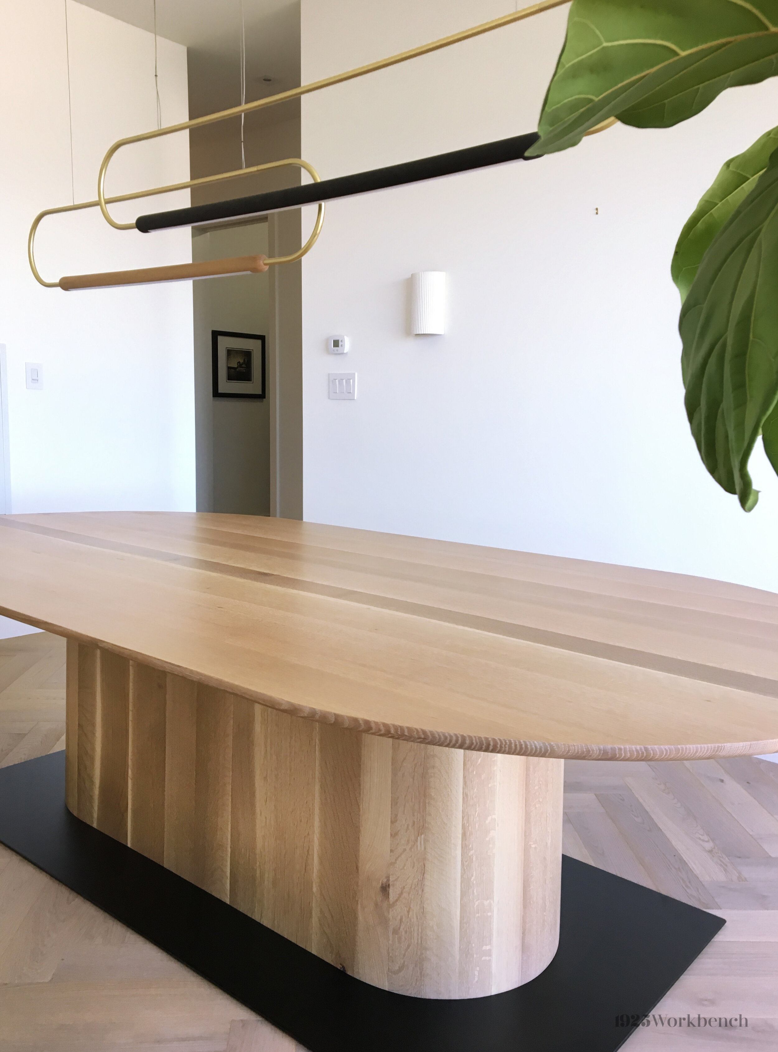
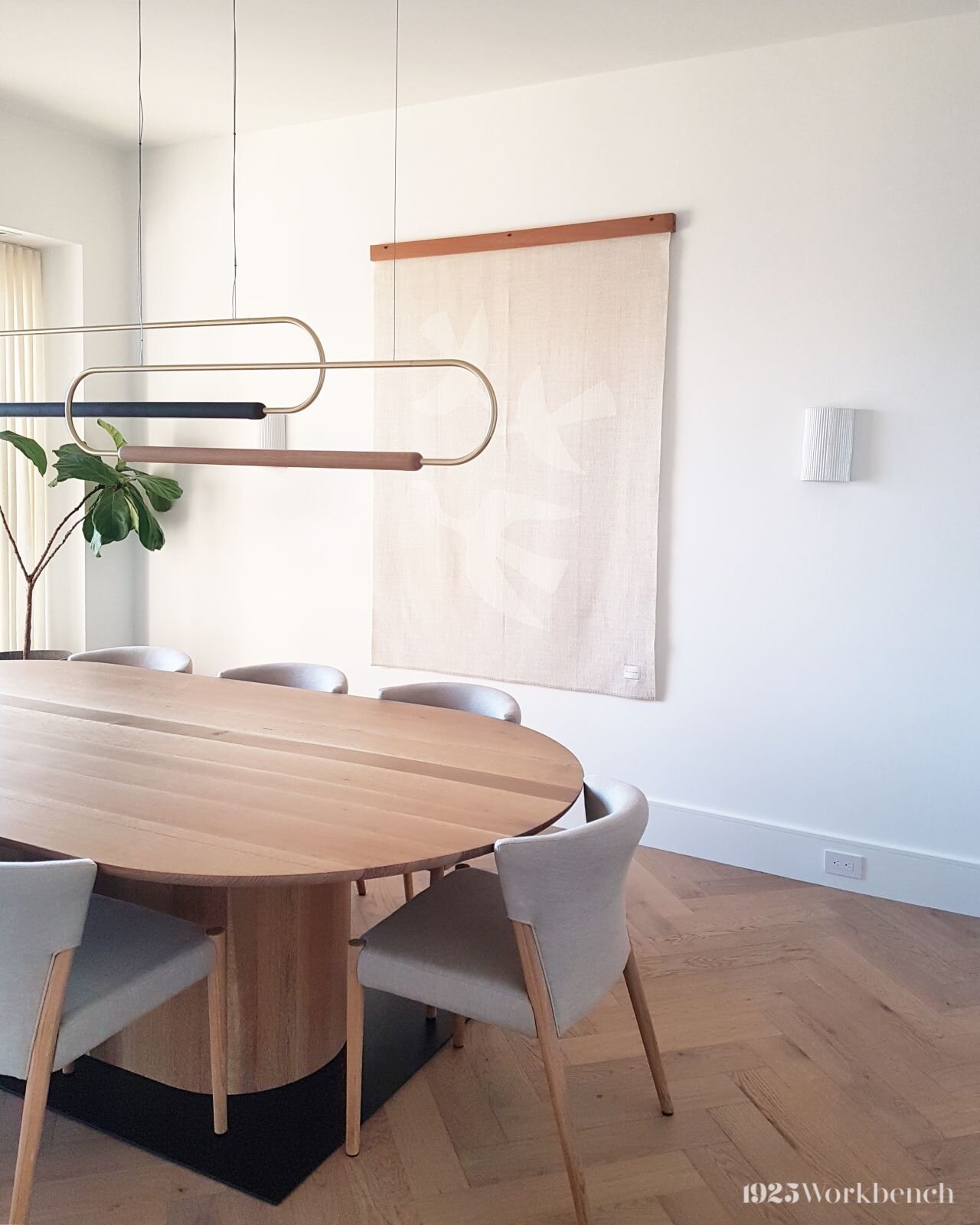
When a client of Campbell Drummond Design wanted a table with a sculptural base that echoed the shape of race track, we collaborated to bring their vision to life.

Being a large table, we had to consider stability and balance. After tweaking the design, we decided on a black metal base at the bottom. It allows for sufficient leg room while ensuring the table is sturdy.

More projects

We made a table for one of Feasby and Bleeks’s designs, featured in Home & Home magazine. The home was picked as “best home of the year.” See it here!

For Judy Petersiel Design, we made a black stained oak piece with a metal base (made in-house!) with brass plating. At 9 feet long, the table anchors the room.

Contact us

If you would like us to make something for you, email us at info@1925workbench.com with pictures of your space and measurements.

Find us on Instagram: @1925workbench.

The scroll tray

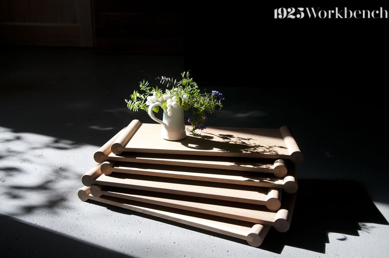
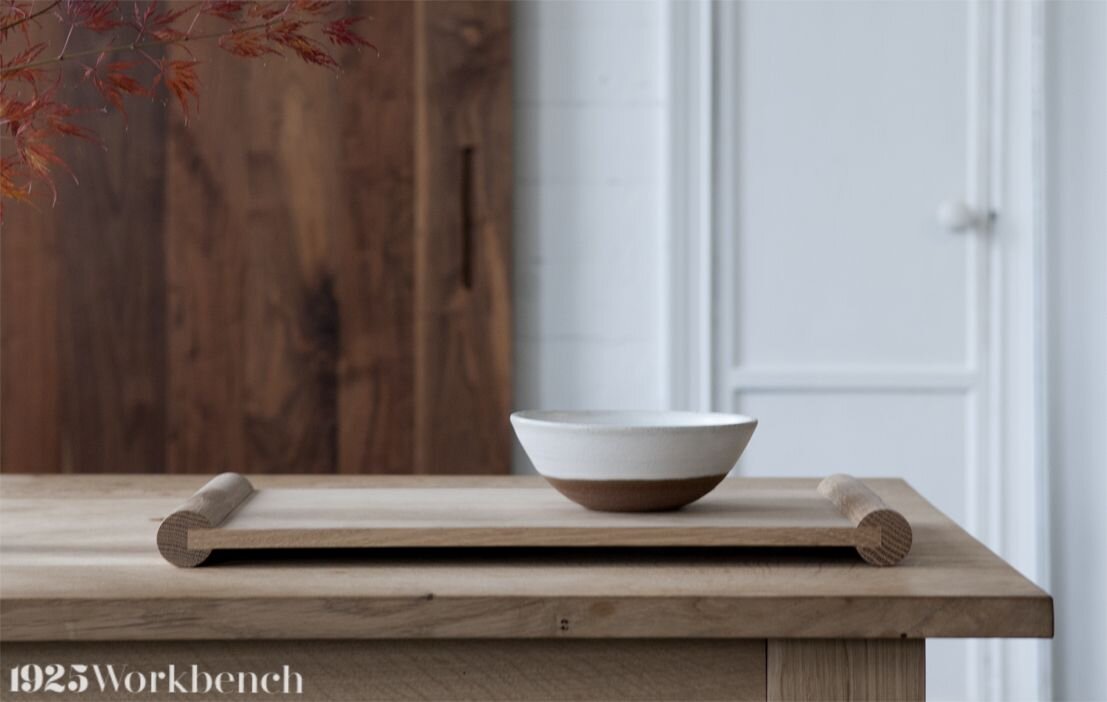
Inspired by our piping table and made to look like an open scroll, this piece is simple and beautiful. Just the way we like it.

The scroll tray story

Collaborating with Akai Ceramics at the 2018 Interior Design Show, we displayed their ceramic pieces on our piping table. To say thank you, we drew inspiration from our piping table to create these special trays as a gift. We decided to call it the scroll tray. Made in white oak, we consider this our signature small piece.

Tim Lam incorporated our trays in his design for the One Room Challenge. See if you can spot them here!

Our piping table

The inspiration for our scroll trays is our very own piping table, the name being inspired by its pipe-shaped legs. The design was guided by our recollection of bamboo daybeds in Vietnam looked like.

And yes, we make tables and desks too! Blog post on this coming soon.

If you want us to make something for you, please email us with pictures of your space and dimensions to info@1925workbench.com.

Keep up with us on Instagram: @1925workbench.

eZy_watermark_14-11-2019_11-11-14.jpg
Our very own piping table.

Our very own piping table.

Space Saving for Small Mudroom

For a small house without a hallway closet, this little built-in was the best solution for storage, and a coat station. The space is in the back room where where coats, shoes, bags, etc. were dumped,  it was always a mess... ...until now.  A space of 44" w x 96 h x 18" d was salvaged for a built-in entirely of solid white oak to act as a pantry, coat closet, shoe rack, purse rack, and everything in between.

This little room in the back of the house use to be the kitchen!  Can  you believe it? I'm a believer in small space living and even though I'm not a cook, this kitchen was a little too little.

View of our kitchen.


The cabinet oors are painted a blue that would contrast gently with the white oak and yellow door.

Close up of the walnut handle, it's a clean and crisp line and it goes with all our walnut pieces such as the dinning table, console, and vanity in the powder room.

If you would like a build-in storage unit with thoughtful space saving considerations...consider talking to us!